We ship solutions
to well-discovered
problems.
Noocleus is a product & software studio with a startup studio inside of it. We build for ourselves, for other founders, and for companies that want to move at startup speed. This is the visual system that carries the work.
Calm, precise,
rooted in craft.
The system is light-first because most of our work lives in documentation, decks, and writing. The hexagon and the green mark carry the energy — everything else stays out of the way.
Discovery before shipping
Nothing leaves the studio until the problem is known cold. The visual system reinforces that discipline — space to think, space to read.
Startup speed, studio standards
We move fast, but nothing looks rushed. Typography, spacing and the hex motif give docs a consistent, confident rhythm.
Organic & technical
Honeycomb geometry and a living green. Precision you can trust, warmth you want to work inside. Never sterile, never decorative.
One green.
Everything else earthy.
Noocleus Green is the only saturated color in the system. Neutrals are warm, running from a near-black ink to an off-white paper — never pure black or white. No gradients except in print collateral.
Brand
Neutrals — warm earth ramp
Approved pairings
Two pairings.
Pick one and commit.
We're exploring a technical pairing (Space Grotesk + JetBrains Mono) and an editorial pairing (Inter Tight + Fraunces italic). The whole page updates when you switch. Use the Tweaks panel to compare.
We ship solutions
to well-discovered problems.
Space Grotesk carries both display and body. Its open apertures and subtle geometry feel modern without leaning cold. JetBrains Mono does all of the UPPERCASE metadata, labels, and code. Technical, deliberate, a little futuristic.
We ship solutions to well‑discovered problems.
Inter Tight is a cleaner, more humanist workhorse. Fraunces in italic drops in as an accent for emphasis, pull-quotes and the occasional word inside a headline. Organic, considered, a little literary.
Scale
The honeycomb
is the system.
The hex is a primitive, not decoration. It's an icon frame, a section tick, a background grid, a divider, a badge. One shape, used at five sizes, with three fills.
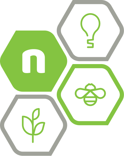
Four core glyphs.
Housed in hexagons.
The icon set is small on purpose — bulb, wrench, plant, and the Noocleus N. Each one lives inside a hex container when used at feature-size; stroke-only when used inline next to type.
Primitive 01 — Hexagon
The hexagon is a single colorable shape. Fill with any brand color. Use alone as a graphic element or compose with a glyph.


Primitive 02 — Glyphs
Four-glyph icon set. Each is monochrome and colorable via currentColor. Use inline next to type, or compose inside a hexagon.
Component — Hex + Glyph
Compose the hex primitive with any glyph. Default placement: glyph centered, paper-colored, inside a solid-green hex.
Container variants
Icon placement with titles
Engineering handoff
A clean contract between design and engineering. Specs, tokens, and edge cases all in one place.
Discovery artifact
Before code: the problem brief, user map, and the constraints we agreed on.
Documentation-first
component set.
These are the pieces you'll reach for when writing a brief, a case study, or a handoff doc. Titles, callouts, tables, quotes, code, badges, and buttons. Every one uses the hex tick as a visual anchor.
Shipping well-discovered problems
Section titles combine a kicker line, an optional mono date, the title itself, and a short deck. The hex tick sets the rhythm.
| Variant | Use for |
|---|---|
| Primary | The single most important CTA on a page |
| Ink | Secondary CTAs, internal navigation |
| Outline | Alternative action next to primary |
| Ghost | Cancel, dismiss, low-weight link-outs |
Use for supplementary context inside documentation.
For decisions that lock in constraints downstream.
For issues the reader needs to fix before continuing.
| Token | Value | Use |
|---|---|---|
| color.brand | #84C441 | Primary accent |
| color.ink | #17130E | Foreground · dark |
| color.paper | #F8FAF4 | Surface · light |
| radius.sm | 4px | Inline UI |
| radius.md | 8px | Cards, modals |
Honeycomb
backgrounds.
Two canonical backgrounds: a dark Ink canvas with a faint honeycomb and a single green mark; a light Paper canvas with the same honeycomb and a glowing centered mark. Use for slide openers, social squares, and section dividers.
Print, deck, social,
email — one kit.
All of the above, applied. Same mark, same hex, same type pairing, same two backgrounds.
Business card · front
Deck slide, social square, email
What we shipped this week
Three releases, one retro, and a new discovery framework we've been using with founders.